Key Takeaways
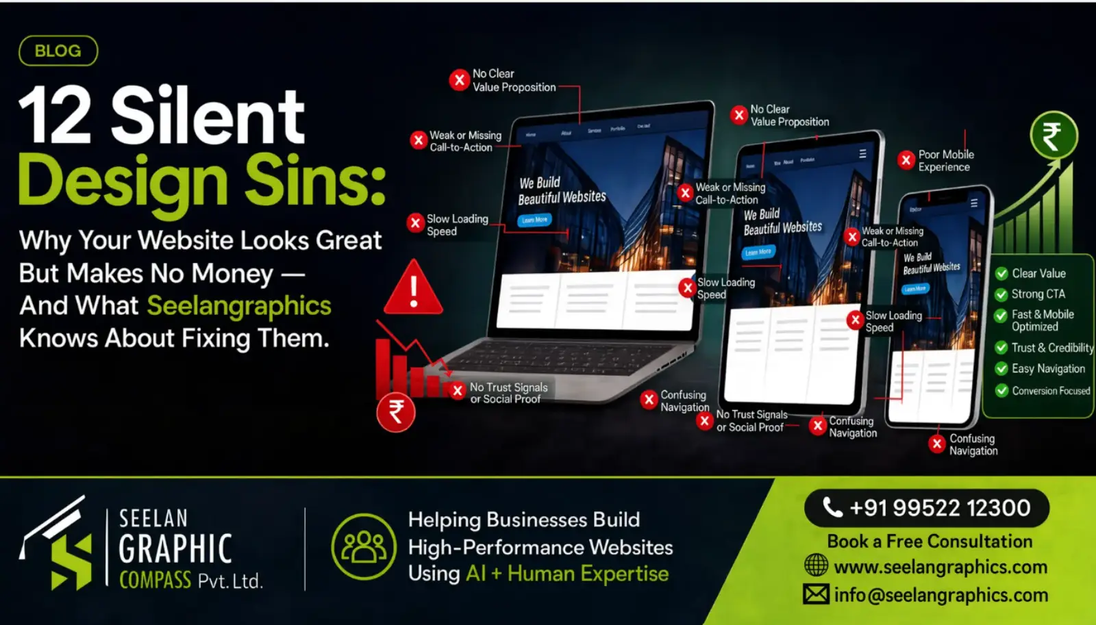
- Aesthetics without hierarchy is digital wallpaper — your website can look stunning and still fail commercially if the eye isn't guided toward action
- Navigation should feel like a well-organised store — every critical page should be reachable in two clicks or fewer, with clear, conventional labels
- Page speed is a revenue lever — bounce probability jumps 32% when load time goes from 1 second to 3 seconds, and hits 90% at 5 seconds
- Your CTA should create contrast — benefit-driven language with adequate whitespace consistently outperforms generic, crowded buttons
- Lead with your solution, not your story — visitors arrive with a problem; establish relevance before sharing your founding narrative
- Every form field is an act of aggression — there's a direct inverse relationship between field count and completion rate
- Trust signals belong next to your CTA — social proof at the moment of highest hesitation has outsized impact
- A sharp value proposition beats great design — mediocre design with a strong value prop can outperform stunning design by 3x or more
Executive Summary
Quick Answer: Why does my beautiful website make no money?
Because beauty and profitability are not the same thing. A website that looks stunning but ignores visual hierarchy, navigation usability, page speed, CTA placement, mobile experience, trust signals, and value proposition clarity will fail commercially — no matter how good it looks in a screenshot.
This guide diagnoses the 12 silent design sins that kill conversions, drawn from real experience auditing and rebuilding hundreds of websites for businesses across India, the UAE, the UK, and the USA.
Introduction: The Graveyard of Gorgeous Websites
Every year, businesses pour billions into beautiful websites that function essentially as expensive digital wallpaper. The designs are stunning. The animations are buttery. The colour palettes could make a Pantone swatch book weep with envy. And yet — the revenue needle barely twitches. This paradox sits at the intersection of aesthetics and commerce, a place where many designers fear to tread honestly and where most business owners don't even know to look. What you're about to read isn't another listicle of vague tips. It's a diagnosis. Because somewhere between "looks amazing" and "makes money," there's a graveyard of gorgeous websites that never converted a single meaningful visitor into a paying customer. And the reasons are almost always silent — invisible to the untrained eye but absolutely devastating to the bottom line.
At Seelan Graphics, we've seen this story play out hundreds of times. A client comes in thrilled with their site's visual appeal but baffled by the lack of results. And honestly? The problems are rarely where people expect them to be.
Let's pull back the curtain.
Sin #1: Prioritising Aesthetics Over Hierarchy
Here's a truth that stings: most visually stunning websites are designed to impress other designers, not to serve actual users. There's a critical difference between a website that looks good and one that works well. Visual hierarchy — the deliberate arrangement of elements so the eye travels in a specific, intentional order — is the skeleton that commerce hangs on. Without it, visitors land on your page, admire the scenery, and leave without taking action.
I've personally reviewed sites where the hero banner was a full-bleed cinematic photograph, absolutely breathtaking, but the call-to-action button was a whisper-thin line of text in 12px font tucked into a corner. The designer was thinking like an artist. The business needed an architect.
The fix isn't to make things ugly. It's to understand that beauty should serve purpose. Your headline, your value proposition, and your primary CTA should hit the visitor's eye before anything else — including that gorgeous parallax background you spent three weeks perfecting.
Sin #2: Navigation That Feels Like a Treasure Hunt
There's a rule in UX that doesn't get quoted nearly enough: every click a user has to think about is a click they might not make. Complex navigation menus with clever category names, hidden hamburger menus on desktop (please, stop doing this), and deep-nested page structures create friction. Friction kills conversions.
A website's navigation should feel like walking through a well-organised store where the signage is clear and the aisles make intuitive sense. When someone lands on your homepage, they should be able to reach any critical page in two clicks or fewer. Not three. Not "well, if they scroll down they'll find the dropdown." Two.
I'll go further — and this might ruffle some feathers — mega menus are overused. They became trendy around 2016 and never quite went away. For e-commerce sites with 500+ products, sure, they have a place. For a service-based business with five offerings? A mega menu is like bringing a semi-truck to deliver a pizza.
Sin #3: Speed Sacrificed on the Altar of Spectacle
Page speed isn't a technical afterthought; it's a revenue lever. Google has published data showing that as page load time goes from one second to three seconds, bounce probability increases by 32%. Jump to five seconds, and it climbs to 90%. Those aren't abstract numbers — that's money walking out the door. The cost of a slow site is also a key factor in our business website cost breakdown — cheap hosting is the #1 performance killer in India.
The silent sin here is that the most beautiful design elements are often the heaviest. Uncompressed hero images. Custom web fonts stacked four or five deep. Video backgrounds that auto-play in 4K. JavaScript animations that fire on scroll. Each one individually might seem fine. Stacked together, they turn your website into a digital tar pit.
At Seelan Graphics, we've made it a practice to run Lighthouse audits before any design is considered final. Because a website that takes six seconds to load on mobile isn't a website — it's a patience test that most people fail.
Sin #4: The "About Us" Page Nobody Asked For (In the Wrong Place)
This one's subtle but pervasive. Many businesses lead with their story instead of their solution. Your homepage opens with "Founded in 2008 by two passionate entrepreneurs who believed in..." — and already, the visitor's eyes have glazed over. Not because your story doesn't matter. It does. But timing matters more.
A visitor arrives with a problem. They want to know — within seconds — whether you can solve it. Your founding story, your team photos, your mission statement? Those belong after you've established relevance. They're trust-builders, not openers.
Think of it this way: if you walked into a doctor's office with a broken arm and the receptionist started telling you about the physician's childhood dream of practising medicine, you'd probably leave and find someone who'd just look at the arm first.
Sin #5: Call-to-Action Buttons That Whisper Instead of Speak
The CTA is the single most important element on any commercial webpage. Full stop. And yet, an alarming number of beautifully designed sites treat it like an afterthought — a small, tastefully muted button in a colour that "harmonises with the palette" but blends into the background like camouflage.
Your CTA should create contrast. Not obnoxious, eye-searing contrast, but enough visual differentiation that it's unmistakably the thing to click. The language matters too. "Submit" is not a call to action. "Get Started" is barely one. "Show Me My Custom Quote" — now we're talking. Specificity and benefit-driven language outperform generic labels every single time.
Here's a small detail that makes a measurable difference: the whitespace around your CTA. Crowded buttons get ignored. Give your CTA room to breathe, and click-through rates climb. We've seen this play out consistently across client projects.
Sin #6: Writing for Search Engines, Not Human Beings
SEO matters — nobody's arguing otherwise. But somewhere along the way, the pendulum swung so far toward keyword optimisation that many websites read like they were written by a committee of algorithms rather than a person who actually understands the customer.
"Looking for premium digital marketing solutions? Our digital marketing services offer best-in-class digital marketing strategies for your digital marketing needs."
That sentence is technically optimised. It's also insufferable to read. And here's the thing Google itself has been signalling for years now: quality content that serves user intent ranks better than keyword-stuffed gibberish. The Helpful Content Update made this explicit. Write for the person sitting across the table from you. The search engine will follow.
Good web copy should feel like a conversation — informed, specific, and honest. If your product page reads like a term paper, you've committed this sin.
Sin #7: Mobile Experience Treated as an Afterthought
We're well past the point where "mobile-responsive" is a checkbox feature. Over 60% of web traffic now comes from mobile devices, and for many industries, that number is north of 75%. Despite this, an unsettling number of websites are still designed desktop-first with mobile as a shrunken, awkward adaptation.
The silent sin isn't just about responsive breakpoints. It's about experience. Tap targets that are too small. Forms with fifteen fields on a 5-inch screen. Image carousels that require precision swiping. Text that's technically readable but uncomfortable at mobile scale.
Designing mobile-first isn't just a development methodology — it's a philosophical commitment to meeting your customers where they actually are. And where they are, increasingly, is on a phone while standing in line at the grocery store with exactly three seconds of patience to spare. For ecommerce stores, mobile conversion is even more critical — see our ecommerce conversion guide for mobile-specific strategies.
Sin #8: Trust Signals Buried or Missing Entirely
Humans are wired for skepticism online. Decades of scam emails, fake reviews, and data breaches have conditioned us to approach unfamiliar websites with our guard up. The antidote is trust — but trust has to be demonstrated, not just declared.
Testimonials, case studies, client logos, security badges, industry certifications, money-back guarantees, real team photos (not stock imagery of smiling people in a conference room nobody has ever sat in) — these elements should be strategically placed throughout the user journey, not buried on a single testimonials page that nobody visits.
One pattern we've noticed at Seelan Graphics that makes a significant difference: placing a brief, genuine testimonial directly next to the primary CTA. It creates a moment of social proof at the exact point where hesitation is highest. It's a small architectural decision with outsized impact.
Sin #9: Ignoring the Fold (Yes, It Still Matters)
The debate about "the fold" — the portion of a webpage visible without scrolling — has been going on since the early 2000s. And while it's true that users do scroll, the research consistently shows that content above the fold receives disproportionately more attention. Nielsen Norman Group has published findings indicating that users spend roughly 57% of their page-viewing time above the fold.
So what are you putting there? If the answer is a vague tagline, a decorative image, and no clear path forward, you're wasting the most valuable real estate on your entire site. The above-the-fold area should answer three questions immediately: What is this? Is it for me? What should I do next?
That's it. Three questions. And if a visitor has to scroll to answer any of them, you've lost a percentage of your audience that you'll never get back.
Sin #10: Form Friction — Asking Too Much Too Soon
There's a direct, well-documented inverse relationship between the number of fields in a form and the completion rate. Every additional field you add is a tiny act of aggression against the user's time and willingness. And yet, I routinely encounter contact forms that ask for full name, email, phone, company name, company size, industry, budget range, project timeline, and "how did you hear about us?" — all before the person has even decided if they want to talk to you.
Ask yourself: what's the absolute minimum information you need to start a conversation? Usually it's a name and an email. Maybe a brief message. Everything else can be gathered during the actual conversation. You don't propose marriage on the first date — don't ask for a prospect's life story in a lead form.
Multi-step forms can mitigate this somewhat. Breaking a longer form into two or three stages with progress indicators feels less overwhelming than a single wall of fields. But the best approach is almost always: less is more.
Sin #11: Inconsistent Branding That Creates Cognitive Dissonance
This one's sneaky because it often lives below conscious awareness. A visitor might not be able to articulate why a website feels "off," but inconsistent use of colours, typography, spacing, tone of voice, and imagery creates a subliminal sense of unreliability.
If your homepage has a warm, conversational tone but your services page reads like a legal document, that's dissonance. If you use a rounded sans-serif font in your logo but a sharp serif throughout the body copy for no clear typographic reason, that's dissonance. If your Instagram feed is playful and colourful but your website is corporate gray, visitors who arrive from social media will feel like they've walked into the wrong building.
Brand consistency isn't about rigid uniformity — it's about coherence. Every touchpoint should feel like it belongs to the same organism. When it doesn't, trust erodes in ways that don't show up in analytics but absolutely show up in revenue.
Sin #12: No Clear Value Proposition — Or Worse, a Boring One
This might be the most damaging sin of all, and it's the one that ties everything else together. A value proposition isn't a tagline. It's not "We deliver excellence" or "Your success is our passion" or any other phrase that could be plastered on the wall of literally any business in any industry on earth.
A real value proposition answers a devastatingly specific question: Why should I choose you over every other option, including doing nothing?
If your website can't answer that question in ten seconds or fewer, no amount of design polish will save it. I've seen websites with mediocre design and strong value propositions outperform stunningly designed competitors by 3x or more. Because at the end of the day, people don't buy design. They buy solutions to problems, delivered by people they trust, at a price that makes sense.
Crafting a sharp value proposition requires uncomfortable honesty. You have to know what you're actually best at — not what you wish you were best at. You have to understand your customer's real pain points — not the ones you assume they have. And you have to be willing to say something specific enough that it won't apply to everyone. Because trying to appeal to everyone is the fastest path to resonating with no one.
So What Now?
If you've read through these twelve sins and recognised your own website in more than a few of them — don't panic. Almost every website we've worked with at Seelan Graphics has committed at least three or four of these. Some have committed all twelve and still managed to stay in business, which is a testament to the strength of their underlying product or service. But imagine what those businesses could do if the website was actually working for them instead of just sitting there looking pretty.
The gap between a beautiful website and a profitable one isn't as wide as it seems. It's not about starting over or stripping away everything that makes your site visually compelling. It's about realigning priorities — making sure that every design decision, every word of copy, every animation, every button colour serves a strategic purpose beyond "looks nice."
Beauty and profitability aren't mutually exclusive. But beauty alone has never paid anyone's bills. The websites that generate real revenue are the ones where someone sat down and asked, at every stage of the design process: Does this serve the visitor, or does this serve the designer's portfolio?
That question — asked honestly and answered ruthlessly — is worth more than any redesign budget you'll ever spend.
References & Further Reading
- Krug, Steve. Don't Make Me Think, Revisited: A Common Sense Approach to Web Usability. 3rd ed., New Riders, 2014.
- Nielsen, Jakob, and Kara Pernice. Eyetracking Web Usability. New Riders, 2010.
- Weinschenk, Susan. 100 Things Every Designer Needs to Know About People. 2nd ed., New Riders, 2020.
- Porter, Joshua. Designing for the Social Web. New Riders, 2008.
- Google. "Find Out How You Stack Up to New Industry Benchmarks for Mobile Page Speed." Think with Google, 2018.
- Nielsen Norman Group. "Scrolling and Attention." Nielsen Norman Group, 2018.
- Google Search Central. "What Creators Should Know About Google's Helpful Content Update." Google Search Central, 2022.
- Wroblewski, Luke. Mobile First. A Book Apart, 2011.
- Eisenberg, Bryan, and Jeffrey Eisenberg. Call to Action: Secret Formulas to Improve Online Results. Thomas Nelson, 2006.
This article was last reviewed on July 9, 2026 by the Technical Lead at Seelan Graphics. To find out which design sins your website is committing, request a free audit.
About Seelan Graphics
Seelan Graphics (registered as Seelan Graphic Compass Private Limited) is a web design, digital marketing, and SaaS development company based in Peelamedu, Coimbatore, Tamil Nadu, India.
We provide SEO and digital marketing services, web design and development, custom software development, Branding & Corporate Gifting and UI/UX design for businesses across Coimbatore, Tiruppur, Erode, Salem, Chennai, Bangalore, and international markets including Dubai (UAE), the UK, and the USA.
Seelan Graphic Compass Private Limited Sivasakthi Nagar, Peelamedu, Coimbatore 641004, Tamil Nadu, India 📞 +91-99522-12300 | 🌐 seelangraphics.com | ✉️ Contact Us